Chapter 20 Quantile-Quantile (QQ) plots
20.1 Readings and Resources
- Starmer, J. “Quantiles and Percentiles, Clearly Explained”
20.2 What is a QQ plot?
When we perform an analysis, it is often best to look at the whole distribution of a variable rather than just a single value like the mean or median. A QQ plot is a graphical method for assessing the whole distribution of a variable. There are two main kinds of QQ plots.
- QQ plots for comparing two empirical distributions: If we want to assess the difference between two distributions of data—say, the distribution of response times between two experimental conditions—we can use a QQ plot.
- QQ plots for comparing one empirical distribution to a theoretical one: When our statistical tests have assumptions about distributions—such as that the errors are normally-distributed—it helps to have a way of assessing whether our data badly violate these assumptions. A QQ plot can be used to compare the distribution of our data to what would be expected if, say, the data came from a normal population.6
The “Q”s in “QQ plot” stand for quantile. A quantile is a value such that some fixed proportion of a distribution is less than or equal to that. You might have encountered quantiles before in the guise of “percentiles”, which are the same idea but expressed as percent rather than a proportion.
The most commonly used quantile is the median, which is the \(0.5^{th}\) quantile, or the \(50^{th}\) percentile. The median is the value such that half the distribution is less than or equal to it. Other commonly-used quantiles are the first and third quartiles, which are the \(0.25^{th}\) and \(0.75^{th}\) quantile, or \(25^{th}\) and \(75^{th}\) percentile, respectively.
We can describe an entire distribution to any level of detail with its quantiles. A QQ plot compares two distributions by comparing their quantiles: hence the name quantile-quantile plot.
20.3 Comparing two variables
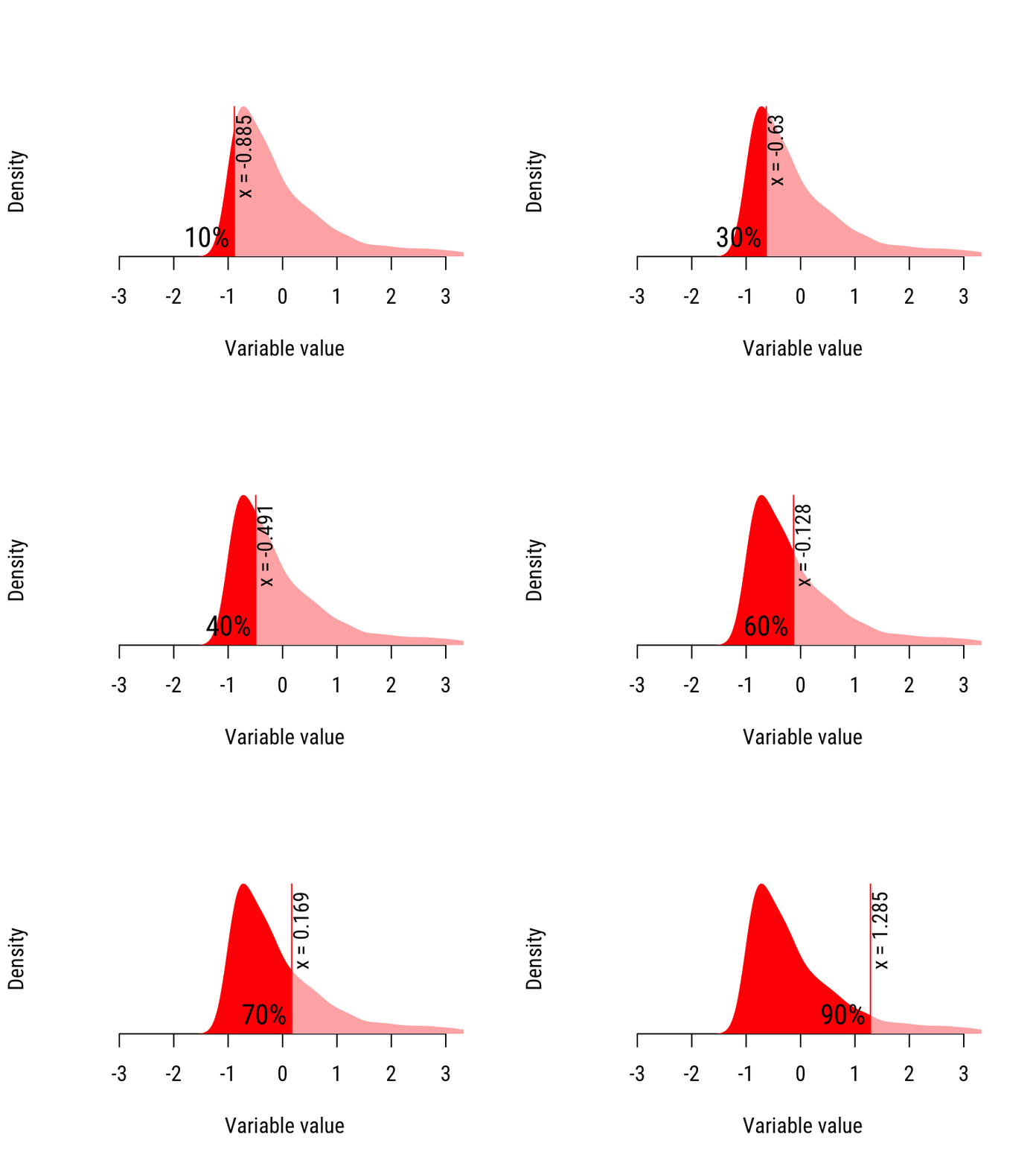
Suppose we had two distributions of data, as seen in Figure 20.1. Suppose that these two distributions are from two tests that someone has argued are interchangable: for instance, a main exam and a resit. We would like to see whether the test scores differ, but of course, we would like to go beyond just testing the mean, because the variance, and the general shape of test scores matters too.
20.1 shows histograms of two data distributions, which we’ll call “Skewed” and “Wide”. We can visually compare them as histograms, but it is difficult because the distributions visually overlap. Also, when the data distributions are noisy (e.g. with smaller sample sizes), differences can be more difficult to discern.
Figure 20.1: Two variables, plotted as smoothed histograms (also called ‘kernel density plots’).
Instead of looking at their histograms, we will convert the histograms into quantiles, then plot them against one another. This will help us to better compare the distributions. Now, we:
- Decide which quantiles. If we choose too many, the QQ plot will be noisy because there will be fewer data points represented at each quantile. If we choose too few, we will not get a good look at the whole distributions. Here, we will choose deciles, or nine values that divide the distributions in to 10 equal parts (analogous to how quartiles are three numbers that divide distributions into four equal parts).
- Compute the quantiles for both variables. This is done by software.
- Plot the quantiles for the two variables against one another.
Figure 20.2 shows how this is done for the “Skewed” variable.

Figure 20.2: Calculating the quantiles of the “Skewed” distribution.
If we had, say, 50 values and we wanted to divide them into 10 parts, we would:
- Sort the values in the variable from least to greatest.
- Take the least \(50/10=5\) sorted values. The greatest value in this batch is the 10% percentile, because 10% of the values in the distribution are less than it.
- Repeat Step 2 for the next 5 sorted values to compute the 20% percentile, etc.
- Stop when we’ve computed all 9 deciles.
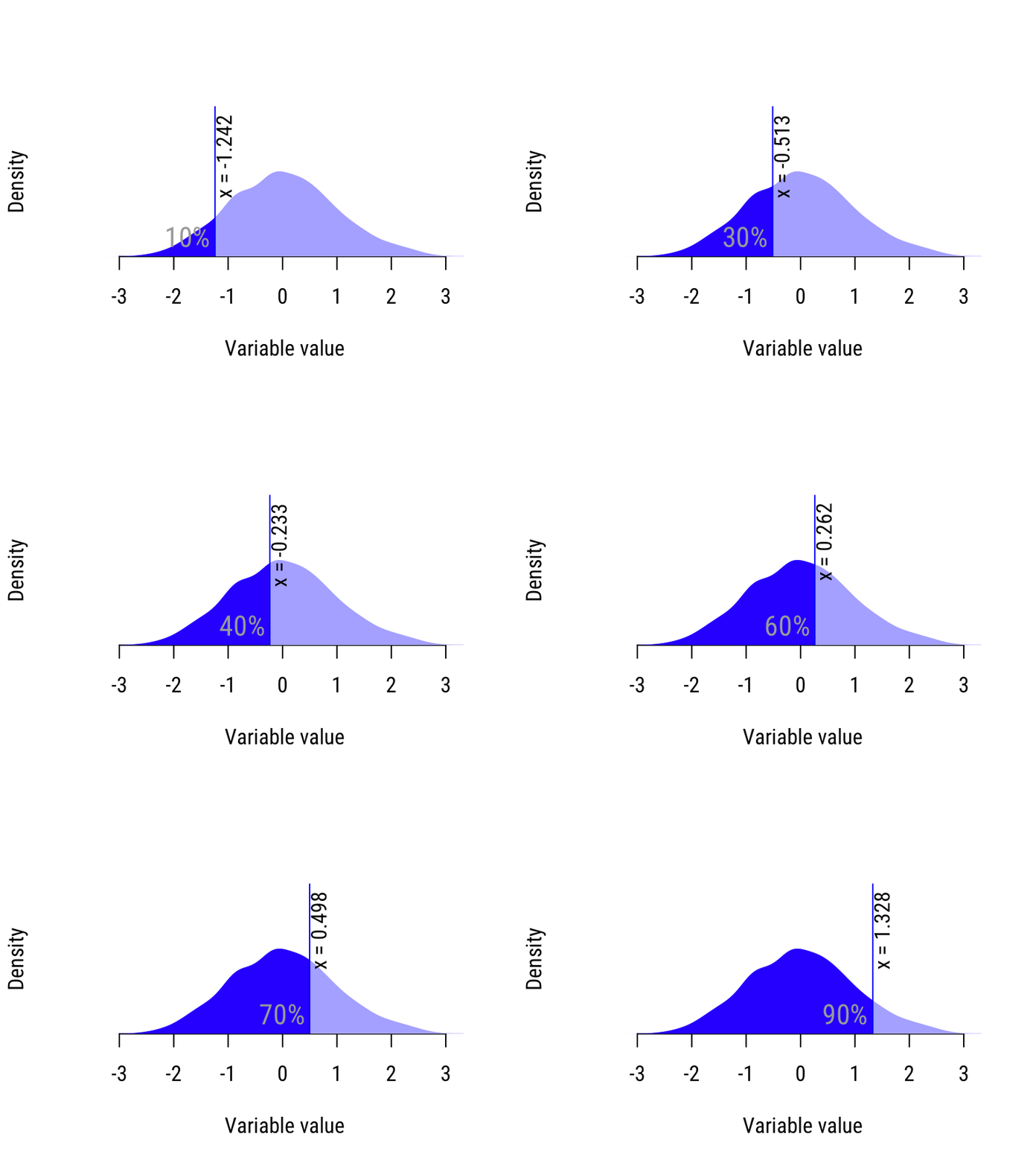
Figure 20.3 shows how this is done for the “wide” variable.

Figure 20.3: Calculating the quantiles of the “wide” distribution.
At the end of this process, we have a list of quantiles/percentiles for each variable. We can compare these values directly, if we like. Notice in the table below that for the 10% and 20% percentiles, the “Skewed” distribution is greater. For all other quantiles, the “wide” distribution is greater.
Put another way, the smallest values from the “wide” distribution tend to be smaller than the smallest values from the “skewed” distribution (look again at Figure 20.1, and you’ll see this.
| Percentile | Red | Blue | Which is larger? |
|---|---|---|---|
| 10% | −0.885 | −1.242 | Skewed |
| 20% | −0.767 | −0.836 | Skewed |
| 30% | −0.630 | −0.513 | Wide |
| 40% | −0.491 | −0.233 | Wide |
| 50% | −0.313 | 0.006 | Wide |
| 60% | −0.128 | 0.262 | Wide |
| 70% | 0.169 | 0.498 | Wide |
| 80% | 0.587 | 0.814 | Wide |
| 90% | 1.285 | 1.328 | Wide |
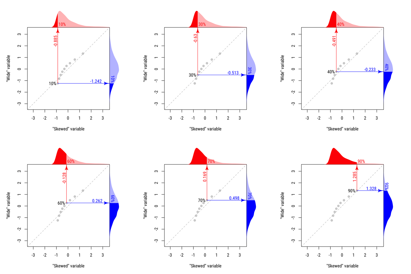
We can see this visually by plotting these values against one another. Figure 20.4 shows the resulting QQ plot. The dashed diagonal line shows where the distributions would be equal. The first two points on the left are lower than the dashed line, indicating that the “skewed” distribution is larger for those values. All other points are above the line, indicating that the “wide” distribution is greater.
Figure 20.4: The QQ plot for the “skewed” distribution against the “wide” distribution.

20.4 Comparing one variable with a theoretical distribution
The most common use for a QQ plot is comparing the distribution of a variable with some theoretical expectation: for instance, assessing whether residuals are normally distributed. The process of constructing a QQ plot in this case is analogous to how it was done above, with two variables. The main difference is the quantiles for the theoretical distribution are not observed. They are computed.
Suppose we had a data distribution we wanted to assess for normality, as in Figure 20.5
## `stat_bin()` using `bins = 30`. Pick better value with `binwidth`.## Warning: Removed 2 rows containing non-finite values (stat_bin).## Warning: Removed 2 rows containing missing values (geom_bar).Figure 20.5: A distribution to assess for normality.
First, notice that the shape of the data in 20.5 does not appear to be normal. It is skewed to the left.
Here is the process of building a QQ plot:
- Determine the “best” fitting parameters for the theoretical distribution. If we were comparing to a normal distribution, this would mean choosing a normal distribution with mean and variance equal to our data mean (18.835) and standard deviation (1.717), as shown in Figure 20.6.
## `stat_bin()` using `bins = 30`. Pick better value with `binwidth`.## Warning: Removed 2 rows containing non-finite values (stat_bin).## Warning: Removed 2 rows containing missing values (geom_bar).Figure 20.6: A distribution to assess for normality, along with a normal curve with the same mean and variance.
- Having determined the “best fitting” normal distribution, we compare the empirical quantiles (from our data) with the ones we’d expect from this normal distribution. In the data set depicted in Figure 20.5, there are \(N=50\) values. Our smallest theoretical quantile is the one for which \(1/51\) of all values7 will be less than that. For the normal, we can look it up in a \(z\) table.
For the smallest six values in the data distribution, the table below shows the theoretical normal quantiles.
| Data (empirical) value | Proportion of distribution | Z score | Theoretical quantile |
|---|---|---|---|
| 11.211 | 1/51 | −2.062 | 15.296 |
| 13.127 | 2/51 | −1.760 | 15.814 |
| 13.730 | 3/51 | −1.565 | 16.149 |
| 17.624 | 4/51 | −1.416 | 16.405 |
| 17.713 | 5/51 | −1.293 | 16.616 |
| 17.768 | 6/51 | −1.187 | 16.798 |
Notice that the smallest value (11.211) is far below where we would expect to find it if the data were normal (15.296). This is a symptom of the left skew.
- We plot the empirical quantiles against the theoretical quantiles.
Figure 20.7: A QQ plot for our data distribution, against the theoretical quantiles from the normal distribution.
Notice that the first point on the left, corresponding to the smallest value in the data set, is far below the diagonal line. As we noted above, this value is far below where we expected it to be (on the QQ plot, this would be on the diagonal line).
If the population from which the data were drawn were normal, we’d expect all the points to roughly fall on the diagonal line. So we’re looking for a deviation from linearity. We can clearly see in Figure 20.7, the QQ plot is strikingly nonlinear: our data distribution is different from what we would expect from a normal population. This was obvious from Figure 20.5, of course, but sometimes it will not as clear from the histogram.
20.5 Interpreting QQ plots
The shape of the QQ plot is diagnostic for the kind of differences there can be between two distributions.
20.5.1 Same distribution
When two distributions are roughly the same, the points on the QQ plot will lie roughly along the diagonal line representing equality.
20.5.2 Same shape, central tendency difference
If the differences differ only in central tendency—what we call a “shift”, or “location” difference—then the points in the QQ plot will be linear with slope 1. They will be parallel to, but not on, the diagonal line representing equality.
The distance of the points from the diagonal line tells you how ,uch the two distributions are shifted from one another.
20.5.3 Same shape, scale difference
A “scale” difference means that the distributions have the same minimum and the same shape, but one distribution is more variable than the other. This is typical of slowing response times, for instance (response times have a minimum of about 0, and slowing them down makes them more variable).
When this happens, our QQ plot is still linear, starts from the diagonal line, but has a slope different from 1. The slope of the QQ plot tells you how difference the scales of the two distributions are.
20.5.4 Same shape, location and scale difference
When we combine two possible differences above, we have a shift and a scale difference. If the shape of the two distributions is the same, but the location and scale are different, this will lead to a linear QQ plot with slope different from 1 that does not meet the diagonal line at the “location” value (eg, the mean, or minimum).
20.5.5 Different shapes
When the distributions being compared have shapes—e.g., one is skewed and the other is symmetric, or they are skewed in different directions—the QQ plot will be curved.
QQ plots are not limited to testing normal population shapes; this is just their most common use.↩︎
It is \(N+1\) because a \(N\) values divide a distribution into \(N+1\) “pieces”. There are, however, multiple subtly different ways of computing quantiles. Different software may have different defaults, but this almost never matters in practice. For reference, I’m describing “Type 6” here, which is the default in SPSS.↩︎