Chapter 8 Two-sample designs
## Parsed with column specification:
## cols(
##   fuseTime = col_double(),
##   condition = col_character(),
##   visual_help = col_character()
## )
8.1 Readings and Resources
- Field (2017)
- Histograms and boxplots, Chapter 5
- Data transformations, Chapter 6
- Mann-Witney U tests, Chapter 7 (7.1-7.5)
- \(t\) tests, Chapter 10
- B. Foltz, “Two Populations, t-test with Hypothesis”
- Rousselet et al (2017). “Beyond differences in means: robust graphical methods to compare two groups in neuroscience”
8.2 Example data set
Frisby and Clatworthy (1975) [DASL] presented random dot stereograms to 78 participants. Each participant was asked to report how long it took them to fuse the random dot stereogram. Of the 78 participants, 35 were given extra visual information about the target image, e.g., in the form of a 3D model. The remaining participants were given no such information (but may have been given other information, e.g., verbal).
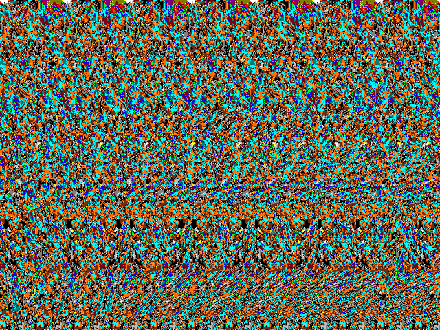
An example of a random dot stereogram is shown below.

A random dot stereogram
If you have never seen a random dot stereogram before, the way they work is that you relax your eyes so that you are not focusing on the dots, but instead “through” the stereogram. If you focus in the right way, the repeating pattern of dots “fuse” into a three-dimensional image. The random-dot stereogram above contains an image of a small box on a platform.
❗ Can’t see it? Click here to get visual help.
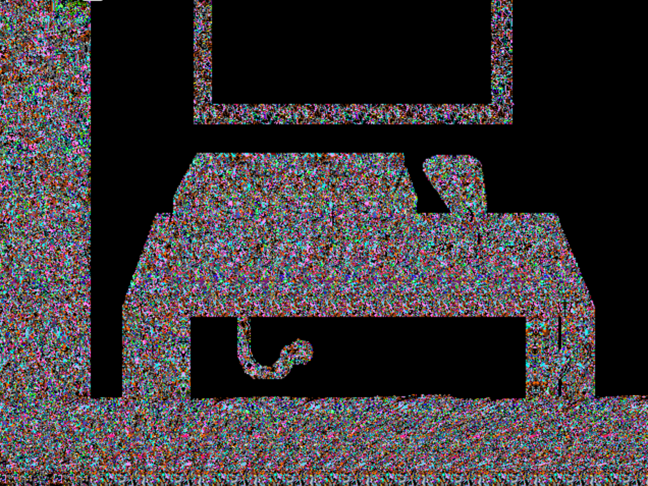
I submitted the image to the Magic Eye Solver and helpfully provided the image below (credit to Dave Stevens, the author of the solver).

“Solved” random dot stereogram
Now that you’ve had some visual help, why not try again?
The question of interest for Frisby & Clatworthy (1975) was whether extra visual information, in the form of a drawing of what affected the fusion times—that is, how long it took the participants to say the image “fused” into a three-dimensional image.
The data set contains two variables of interest to us: fuseTime, the time taken for the participant to report that the stereogram had fused; and visual_help (label NV for no extra visual information, VV for extra visual information).2
8.3 Description
Typically, a table of means, standard deviations, and sample sizes are given in a table. The tables may also contain the minimum and maximum scores, which can help to identify problems with the data set (e.g., if scores are out of a reasonable range, etc).
## `summarise()` ungrouping output (override with `.groups` argument)| Fusion times to random dot stereograms | |||||
|---|---|---|---|---|---|
| Self-reported, in seconds | |||||
| Condition | N | M | SD | Min | Max |
| No visual help | 43 | 8.486 | 8.079 | 1.700 | 47.200 |
| Visual help | 35 | 5.434 | 4.721 | 1.000 | 19.700 |
A table is helpful, but of course is not sufficient to present the data in a transparent manner. For that, we use a visualization.
First, though, notice that the table indicates that there were responses as quick as 1 seconds, and as slow as 47 seconds. Recall that these are self-reported fusion times for random-dot stereograms. Descriptions of the data can serve as sanity checks: do you think it is reasonable that people report fusing a random-dot stereogram in 1 second?
8.4 Visualization
This section outlines a number of possibilities for visualizations for two independent samples, from least informative to most informative (roughly).
8.4.1 Mean/standard error plot
The most common way for data from two independent groups to be presented is a plot of the means and standard deviations. Sometimes these are presented as bars instead of points, or connected lines. Sometimes, the visualization does not even have standard errors.
Figure 8.1 shows the minimum elements you need for a plot of means and standard errors.
## `summarise()` ungrouping output (override with `.groups` argument)Figure 8.1: Mean self-reported fixation times, in seconds, for participants in the control and visual help conditions. Error bars are standard errors of the mean.
In their paper linked under “Resources and Readings” above, Rousselet et al give reasons why such visualizations are inadequate. You should read the paper; in summary, though, they hide the data.
There are 78 response times in the data set. In the graph, these are summarized to only four numbers (two means, two standard errors). The characters of the distributions, and any potential problems, are hidden.
Avoid using this kind of graph to describe your data—at least, by itself. If use this kind of plot, then:
- Use standard errors or confidence intervals instead of standard deviations. If you want to report the standard deviations, put them in a table.
- In the caption, say what the error bars represent (e.g., “Error bars show standard errors of the mean” or “Error bars show 95% confidence intervals”).
- Consider showing additional graphs (as below) that make the full data distributions clearer.
8.4.2 Box plot
Box plots are somewhat better than means and standard errors, because they show the data quartiles (the 25th percentile, median, and 75 percentile) as a box, and extreme values as points.3 The box contains the middle half of the data values.
The box plot can capture the overall variability of the data and some kinds of data quality issues (points that are inconsistent with the rest of their group).
Figure 8.2: Box plot of the sterogram data.
From the box plot, we can see that the fusion times in the “no visual help” condition appear overall slower than the “visual help” condition.
Box plots are kind of a middle ground: they don’t show the inferential standard error that we’d typically like to see, but they also don’t show all the data. Thus, box plots are almost never a good choice by themselves. They can be overlaid on dot plots, however (see below).
8.4.2.1 A potential issue
Even though box plots are, by themselves, not ideal, notice that we have already identified a potential issue we would have missed had we relied on the mean/standard error plot alone. In the “no visual help” group, there is a response time that is much larger than the others (47 seconds); in fact, it is over twice as long as the second-most-extreme value (22 seconds).
Is this a problem? Are they an “outlier”? Maybe. Should we remove them? Probably not, in this case. Fusing random-dot stereograms is not easy; it is entirely possible it takes some people more much time to do it than others, and those longer times should be in the data set.
In other cases, however, outlying points could be caused by a coding error, or someone who stopped paying attention, or any number of other problematic reasons that should be dealt with. You need to see the data before you can make good-quality decisions about it. That’s what visualization is about.
8.4.3 Dot or violin plot
Why not look at all the data? The left panel of Figure 8.3 shows a dot plot of each fusion time. The points are “jittered” (moved randomly) in the \(x\) direction so that they don’t hide one another. We can see where the response times tend to cluster (between 1 and 10 seconds) and the outlying points.
Figure 8.3: Left: Dot plot of the stereogram data. Each point is a participant’s self-reported fusion time. Right: Dot plot, with box plots included.
We’ve lost something, though: the ability to easily visually compare the groups. We can fix that by adding back in the box plot, as the right panel in Figure 8.3 shows.
As an alternative to a box plot, which only shows the quartiles, we can use a so-called “violin plot”. The “violin” is a smoothed histogram folded over so it is symmetric. Where it is wide, there are many points. Where it is narrow, there are few. This gives a finer-grained look at the distribution of the data than a box plot.
Figure 8.4 shows a violin plot of the stereogram data. For completeness, I’ve also added all the data points to the graph.
Figure 8.4: Violin plot showing the stereogram data.
Note regarding SPSS: SPSS is fairly limited in terms of data visualizations. You can create mean/standard error plots and box plots, but anything more sophisticated is not really possible (or difficult). I recommend using other software for visualizing your data. These were created with R and ggplot, which are both free. Other free options, with easier interfaces, are statscloud, JASP, and jamovi.
8.4.4 Quantile-Quantile (QQ)
If we wanted to take a closer look at how the two distributions of self-reported fusion times differ, we might want to consider a different kind of visualization altogether. A QQ plot is ideal way of characterizing the difference between two distributions that isn’t as centered around average differences. For a description of QQ plots, see Chapter 20.
In Figure 8.5, we can see the QQ plot for the fusion times of the two conditions. You can compare these QQ plots to the ones presented in Section 20.5 with their interpretations.
## `summarise()` regrouping output by 'visual_help' (override with `.groups` argument)## `geom_smooth()` using formula 'y ~ x'Figure 8.5: QQ plot of the self-reported fusion times in seconds. Points are deciles.
❗ Which category from Section 20.5 does the QQ plot in Figure 8.5 fall into?
The QQ plot appears to be a line with slope different from 1 that departs from the diagonal line around (0,0), consistent with the one in 20.5.3. This QQ plot is consistent with a scale difference, or, put another way: one distribution is “slowed down” by a fixed percent relative to the other. The slope of the QQ plot is related to how much one distribution is slowed relative to the other.
The deciles for the “no visual help” condition are, on average, 50% slower than those for the “visual help” condition. Because we looked at the whole distribution (or at least the deciles) using the QQ plot, we can be more confident that “50% slowing” characterizes the effect across fusion times, and not just for the mean or median.
Looking at a QQ plot can help you to see aspects of the data you might otherwise miss. If our experimental manipulation had different effects across the distribution of responses—for example, it made the slower responses slower, but the fastest responses even faster—that might indicate something interesting that we would not want to miss!
8.5 Assessing the effect size
8.5.1 Difference in means
One measure of effect size you can report is the difference between the two observed means. This is calculable in any statistics software and will typically come with a confidence interval which you should also report if you decide to report the difference in means as your primary effect size measure.
See Field (2017), Chapter 10, for more details.
❗ Compute the mean difference and the corresponding 95% confidence interval for the stereogram data.
You can do this in any statistical software you like. The easiest way is to click the “Open in statscloud” button next to the data download in Section 8.2 above.
Self-reported fusion times in the “no visual help” condition are, on average, 3.052 seconds slower than those in the “visual help” condition. The 95% confidence interval on this difference is \(CI_{95\%}: [0.124,5.98]\) (in seconds). Notice that the low end of the 95% confidence interval includes very small effect sizes (about 1/8 of a second) suggesting that the data are consistent with the experimental manipulation having almost no effect (but also, on the other end, consistent with it having a larger effect).
You should always keep in mind the assumptions of this analysis, however:
- The mean is a meaningful statistic to calculate (i.e. dependent variable is interval-scaled, or can be treated as such)
- Observations are independent
- Observations are drawn from normal populations
The data appear to have a skewed distribution, which is entirely expected because the response times cannot go below 0. The normal assumption may not be appropriate.
Also, our QQ plot showed that the effect of the manipulation was not a simple shift of the distribution, so the average difference computed here does not characterize the difference very well.4 Later, we will show how data transformation can help us compute a more relevant effect size.
8.5.2 Standardized difference in means
Another way of thinking about the effect size is to assess it in the context of “background” variation. In a two-group design, one way of doing this is to express the effect as a number of standard deviations:
\[ d = \frac{\bar{X}_1 - \bar{X}_2}{s_{pooled}} \] where \(s_{pooled}\) is a number of standard deviations. See Field (2017), Section 3.7.1. Cohen’s \(d\) and Hedges’ \(g\) are similar measures (they differ by a correction term for bias).

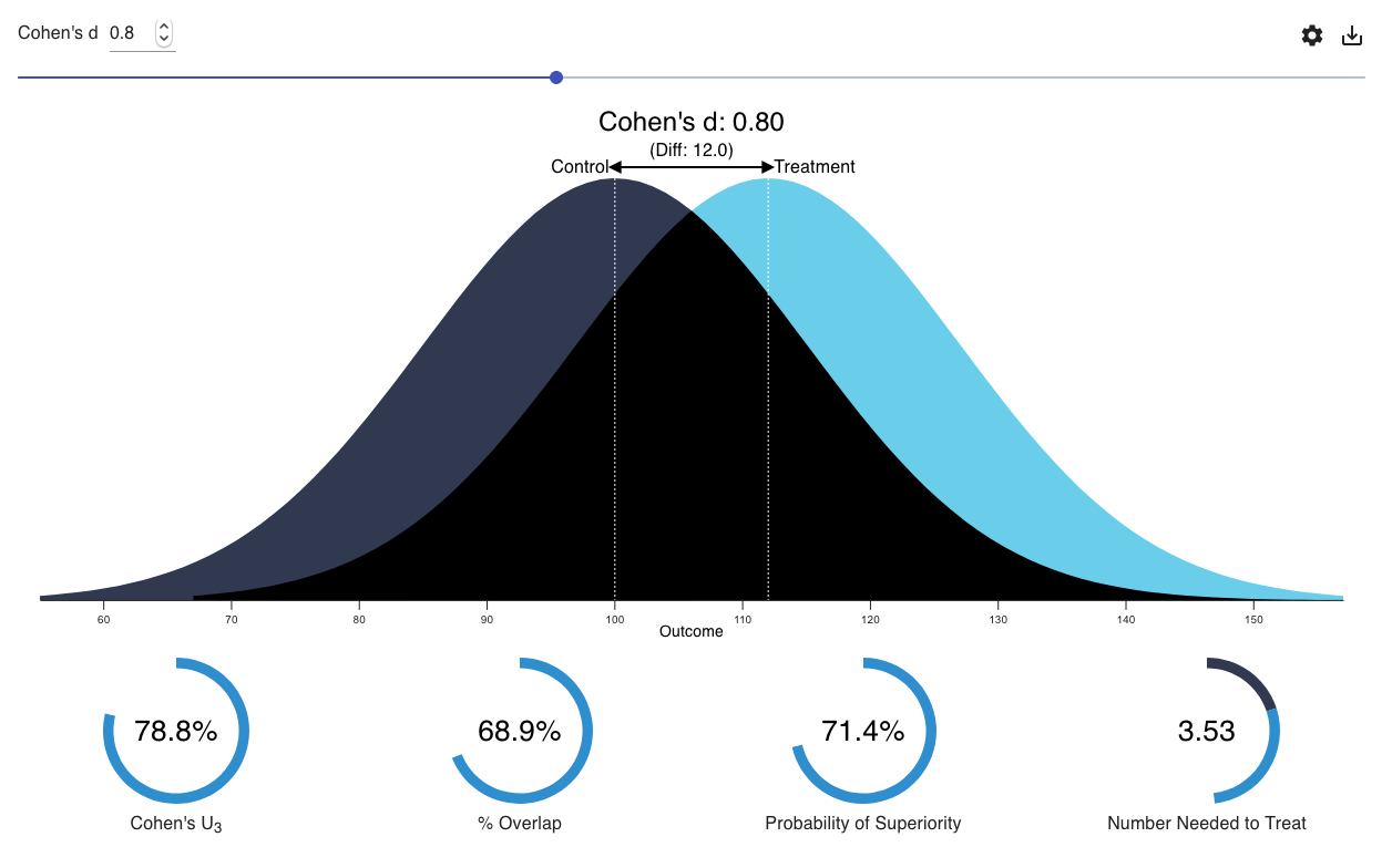
Visualization: see what different values of Cohen's \(d\) mean.
Point estimates \(d\) or \(g\) are easy to obtain; confidence intervals for these quantities, though important to report, are less commonly-expressed in statistical software by default.
One important requirement for the interpretability of standardized effect sizes is that the standard deviations of our two groups be roughly equal. Also, as with the raw difference in the previous section, by using this effect size measure, we’re assuming that the difference of the means characterizes the effect (ie, the effect is merely a change in the means).
The R project for this chapter includes code to compute the effect size and corresponding 95% confidence interval.
❗ Compute Cohen’s \(d\) and the corresponding 95% confidence interval for the stereogram data.
The bit of code in the R project that you’re looking for is this one:
When you run it (along with all the previous code to load the data, etc), it should return this:
##
## Cohen's d
##
## d estimate: 0.45 (small)
## 95 percent confidence interval:
##    lower    upper
## -0.00356  0.90017
Cohen’s \(d\) for these data is \(d=0.45, CI_{95\%}: [-0.004, 0.9]\).
Note that for the same reasons that the difference in means is not the best summary for the stereogram data, the standardised difference in means is also not as adequate as we would like: the effect we see in the data is larger for slower effect sizes.
8.5.3 Difference in trimmed means
8.5.4 Data transformations
💡 Click here for a deeper explanation.
BLAH BLAH
8.6 Model checks
##
##  Fligner-Killeen test of homogeneity of variances
##
## data:  fuseTime by factor(visual_help)
## Fligner-Killeen:med chi-squared = 5, df = 1, p-value = 0.03
8.7 Assessing the null hypothesis of no difference
8.8 A full report
8.9 Things to watch out for
References
Field, A. (2017). Discovering statistics using IBM SPSS (5th ed.). SAGE Publications Ltd.
Frisby, J. P., & Clatworthy, J. L. (1975). Learning to see complex random-dot stereograms. Perception, 4(2), 173–178. Retrieved from https://journals.sagepub.com/doi/10.1068/p040173
The column
conditionis the more fine-grained designation of their conditions that Frisby and Clatworthy considered in their paper; thevisual_helpcolumn is a collapsed version ofcondition. If you’d like to see how the results turned out with the more complicated IV, you can read the paper for more details about what these conditions mean.↩︎Be aware that different software packages may use slightly different algorithms for choosing the “whiskers” and outlying points, so a box plot might look slightly different depending on how you created it.↩︎
In their article, Rousselet et al (2017) suggest a “shift function” to look at the effect across the distribution and not to be fooled by means. The QQ plot is conceptually closely related to their shift function.↩︎